I’ve never been on a Lime bike.
hello.txt
process.txt
skillz.txt
experience.txt
kind_words.txt
harrods_e_brand
gen_possible
low_key_kind
spread_love
msn_messenger
born_again
abington_woods
take_over
harrods_summer
films
peep_show
under_nda
PDF
portfolio.pdf
{{ w.file }}
under_nda
{{ t.file }}
msn_messenger
films
peep_show
lets_talk
Selected work, as a PDF. Password needed. ↓
{{ tipText }}
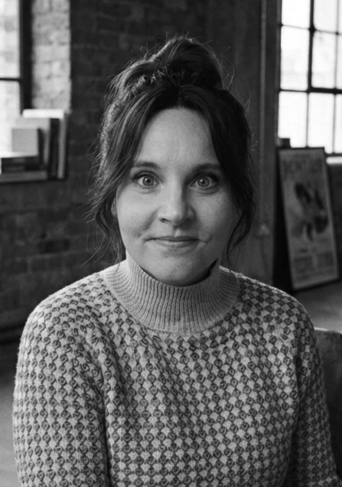 Anna-Liisa Krõlov
Senior Creative & Art Director
Anna-Liisa Krõlov
Senior Creative & Art Director
Work▶
{{ w.name }}{{ w.year }}
about_me▶
Games▶
films
peep_show
msn_messenger
hello.txt
process.txt
skillz.txt
experience.txt
kind_words.txt
brief_invaders
under_nda
lets_talk
PDFportfolio.pdf
bin
hello.txt
›
Hello, I'm Anna-Liisa
strategy · concepts · creative direction · behaviour change
Based in London, working worldwide
10+ years
I do the part most briefs skip: finding the real problem before anyone starts making things. Then I turn that into the strategy, the idea, the art direction and the language to change what people actually do.
I’ve worked across pharma, healthcare, public services, finance, charity and consumer — sometimes on my own, often paired with a copywriter, and always close to the work. I can take something from an unclear problem and first scribble through to client approval, shoots, film, digital, social and final production.
I’m particularly useful when the answer isn’t another execution of the thing everyone has already agreed to.
Where it started
My favourite programme as a child was fifteen minutes of adverts. Soviet-occupied Estonia, where companies had to advertise even when there was nothing to sell. I learned early that an ad can be loved, remembered, and change absolutely nothing. Everything I make is about closing that gap.
Next
process.txt
›
{{ protLabel }}
close ✕
✕
{{ c.label }}
{{ assistText }}
{{ assistSub }}
Anna-Liisa – Conversation
✕
FileEditActionsToolsHelp
To: Anna-Liisa <{{ email }}>
{{ m.label }}
{{ m.text }}
{{ m.text }}
Anna-Liisa is typing…
Send
Anna-Liisa
Online
Currently taking on new work for '26.
New Hardware Found
✕
Your system is missing a driver.
Anna-Liisa
Creative & Art Director
has been detected.
Install now?
INSTALL
STRUGGLE ON
under_nda
Work I can't put on the internet
{{ vaultCount }}
Pharma, public services and finance, mostly.
fetching the list from the server
the server didn't answer
These cases live on the server, not in this page, so they need the gate to be set up. Email me and I'll send them over.
try again
email me
{{ it.name }}
{{ it.client }}
{{ it.year }}
these load from the server, not from this page
lock again
{{ hoverName }}
{{ hoverClient }}
{{ vhName }}
{{ vhClient }}
low_key_kind.case
close ✕
Low-Key Kind
unique · the rare chromosome charity
diagnosis
research
insight
behaviour change
strategy
naming
brand & identity
art direction
design
copy
One awareness day, and no single face to put on a poster.
01
thirteen routes died first
Unique supports families affected by thousands of different rare chromosome and gene disorders. That breaks almost every device an awareness campaign relies on: one condition, one symptom, one face, one story.
Every early route made the family the subject. The public watches, feels something and leaves. Some were moving. One had the best writing in the project. None would change a single Tuesday afternoon in a supermarket.
I stopped asking how to make people understand rarity, and asked what they do when they don’t.
02
I asked both sides of the same moment
Two surveys, one with parents, one with the public. Not do you care about disability (everyone says yes) but what did you actually do, the last time you noticed difference and weren’t sure how to react?
69%had been in that moment and not known what to do.
35%thought the right response to a distressed child was to do nothing or leave.
81%said they would follow clear guidance if it existed.
Nobody was being cruel. Both sides wanted the moment to be easier. Both were making it worse.
03
then I caught myself doing it
The warmer voice. The careful smile. The small head tilt that says I’m one of the good ones. When everyone adjusts themselves by a fraction, it adds up to one message: you’re not being met the same way as everyone else.
The gap wasn’t empathy. It was choreography.
Research calls it over-accommodation: warmth turned up too high stops reading as warmth and starts reading as difference. A guilt campaign would only make people more careful and more frightened of getting it wrong. It had to let people recognise themselves without humiliating them.
04
the idea
Low-key kind. Kindness without making yourself the moment.
Most campaigns in this space ask for more: more awareness, more attention. This one asks for less. Notice without staring. Help without hovering. Invite without pressure. Stay close without needing the perfect words.
Not care less. Perform less. Something people can actually do in a supermarket queue, with two seconds to react.
05
fifty-two moves · a second brand
People said they didn’t know what to do, so it answers that directly. Each card gives one move, then the moment behind it and why the smaller response matters more than the bigger one, organised around the places people get stuck: supermarkets, cafés, transport, parks, schools, parties, playdates.
Then the cards went back to the parents who described those moments, to check the advice was true and hadn’t accidentally created another explaining job for a family.
Unique’s own identity is soft, reassuring and medically credible, right for a family arriving after a diagnosis, but never designed to interrupt a stranger on a train. So rather than stretch one identity until it failed at both jobs, Low-key kind became a separate outward-facing brand: a website by situation, a pocket book, a deck of moves, posters and merch.
The condition is rare. The reaction is common.
the work
More work
{{ n.name }}
{{ n.client }}
anna-liisa krolov · senior creative & art director
spread_love.case
close ✕
Spread Love
confidante · sexual wellness
creative strategy
behaviour change
campaign concept
art direction
copywriting
visual identity
campaign design
OOH
digital
website
film
brand activation
People weren’t avoiding STI tests because they didn’t know they existed. They were avoiding what getting tested seemed to say about them.
01
the problem
Confidante wanted to become the number one home STI test in the market. The job was to raise awareness, drive sales and encourage regular testing, especially when people changed sexual partners.
The clue was in the behaviour. In Northern Ireland, some customers were travelling up to twenty miles to buy sexual-health products somewhere they were less likely to bump into somebody they knew. That wasn’t an awareness problem. It was stigma changing behaviour.
STI testing is usually framed as something you do after a scare, a symptom or a reason to worry. So even responsible behaviour can feel like an admission that something has gone wrong.
02
the idea
We changed the meaning of testing. Instead of fear, embarrassment and awkward euphemisms, we moved the conversation into sexual wellness and self-care. Testing became something you do because you look after yourself, not because you are ashamed or worried.
Take control of your sexual health.
Make testing part of your healthcare routine.
Bold colour, confident people and a simple yellow smile gave the campaign a visual language that felt positive, normal and public. The smile became shorthand for the idea: I look after my sexual health.
The platform ran across OOH, digital, film and the website. We also created a testing card with spaces for repeat test dates and smiley stamps, turning regular testing into something tangible and repeatable.
03
why it works · behaviour change
from
I get tested when I think something might be wrong.
to
Testing is part of how I look after myself.
The campaign didn’t just ask people to think differently about STI testing. It gave them a more positive reason to actually do it.
the work
More work
{{ n.name }}
{{ n.client }}
anna-liisa krolov · senior creative & art director
born_again.case
close ✕
Reborn Electric
bedeo · winning pitch · gravity global
winning pitch
platform
copy
art direction
OOH
digital
Your vans. Reborn electric.
01
the problem
BEDEO had a genuinely useful offer: take an existing diesel van and convert it to electric instead of replacing the whole vehicle. For fleet operators, that meant a way to cut emissions, work towards ESG targets and extend the life of vehicles they had already paid for.
The problem was the language around it. “Retrofit” is technically accurate, but it makes a significant transformation sound like maintenance. BEDEO needed a way to make the product feel bigger, more desirable and easier to understand.
02
the idea
We stopped talking about conversion and started talking about rebirth. Reborn Electric turned a technical process into a transformation. Your old diesel van wasn’t being patched up. It was coming back as something better.
That opened up a much more distinctive creative world too. We borrowed the visual language of revelation and celebration: raised arms, sunlight breaking through, that slightly ridiculous moment of pure joy when you realise you can keep the vans you already own and make them electric.
The humour gave a serious B2B product some personality, while the proposition stayed very clear:
Your vans. Reborn electric.
From there, the idea could flex around different reasons to convert (lower total cost of ownership, ESG targets and extending fleet life) without losing the central thought.
03
why it worked
It gave a dry engineering proposition an emotional idea people could actually remember. Instead of leading with process, specifications or the mechanics of retrofitting, the campaign led with the outcome: the same vehicle, given a second life.
The “reborn” thought also created a complete visual and verbal system rather than a single campaign line. It could live on advertising, digital, social and, most importantly, on the vans themselves. That made the product its own media.
And the idea was strong enough to win the pitch. A technical conversion became a resurrection story.
the work
More work
{{ n.name }}
{{ n.client }}
anna-liisa krolov · senior creative & art director
harrods_summer.case
close ✕
Harrods Summer Recruitment
harrods · summer sales associate
concept
art direction
design
Whatever your passion, shape it at Harrods.
01
the problem
Harrods didn’t have an application problem. It needed the right applicants.
For its summer temporary roles, previous retail experience wasn’t necessarily what made someone good at the job. Product knowledge could be taught. What mattered more was curiosity, warmth, enthusiasm and the instinct to help somebody.
The challenge was to attract people with those qualities, including people who might never have thought of themselves as a natural fit for Harrods.
02
the idea
We looked at what people already cared about. The person fascinated by the construction of a jacket. The friend everyone calls for advice. The person who never grew out of loving toys. The woman who remembers trying on her mother’s dresses.
Those passions might look unrelated to retail, but they contained exactly the qualities Harrods was looking for. So instead of asking candidates to prove they already knew how to work at Harrods, we invited them to bring what was already theirs.
the strategic thought
Just bring yourself.
the campaign platform
Whatever your passion,
shape it at Harrods.
shape it at Harrods.
Each execution paired an iconic product with a handwritten personal story. The product represented the Harrods world; the handwriting revealed the person who might belong inside it.
The result was deliberately premium but personal: generous white space, beautifully isolated objects and individual voices rather than conventional recruitment photography or lists of requirements.
03
why it worked
The campaign changed the entry point. Instead of asking “Do you have retail experience?”, it asked people to recognise the qualities they already had and imagine where those qualities could take them. That made Harrods feel more open without making it feel any less Harrods.
And the response went well beyond the temporary vacancies.
11,186applications submitted, including 1,637 for temporary roles, with traffic driven across Harrods Careers rather than only to the summer positions.
Nominated for the 2018 RMA Award for Recruitment Effectiveness.
Harrods could teach people the products.
The campaign helped find
the people worth teaching.
The campaign helped find
the people worth teaching.
the work
More work
{{ n.name }}
{{ n.client }}
anna-liisa krolov · senior creative & art director
Harrods Employer Brand
close ✕
Harrods Employer Brand
harrods · employer brand
concept
art direction
portraiture
copy
film
internal comms
The many faces of Harrods.
01
the problem
Harrods is one of the most recognisable names in retail. From the outside, everything is polished, controlled and unmistakably Harrods. But an employer brand has to show what it feels like on the inside.
The challenge was to preserve everything that made Harrods iconic while revealing the very different people behind it: different roles, ages, backgrounds, personalities and ambitions.
The brand had one face. The workforce had thousands.
02
the idea
We made the people the face of Harrods. The Faces of Harrods brought together real employees from across the business for a two-day shoot inside the store. Each portrait captured the individual rather than simply the uniform, paired with a personal truth, characteristic or point of view that belonged specifically to them.
Together, the portraits created a different picture of Harrods: not a single type of person expected to fit an institution, but an institution made richer by all the people within it.
The campaign culminated in a hero film shot overnight inside the closed store. With the customers gone and the building almost dreamlike, the focus shifted from the famous surroundings to the people who bring them to life every day.
It wasn’t one face that made Harrods, Harrods. It was all of them.
03
why it worked
Harrods didn’t need help looking prestigious. It needed to make that prestige feel human.
Using real employees meant the diversity in the campaign wasn’t something we had to manufacture or claim. It was already there. Our job was to put it centre stage.
The portraits retained the richness and confidence you expect from Harrods, while the personal stories gave people a reason to look beyond the uniform. The film pushed that thought further, turning an empty store into a stage for the people normally working behind the experience.
The idea could then move naturally across recruitment, internal communications and employer brand activity without losing its central thought.
And it was recognised beyond the business, with the work shortlisted for Best Employer Brand & Internal Comms at the 2019 RMA Awards.
The building may be iconic.
The people are what make it Harrods.
The people are what make it Harrods.
the work
the film
concept · art direction · film
More work
{{ n.name }}
{{ n.client }}
anna-liisa krolov · senior creative & art director
generation_possible.case
close ✕
Generation Possible
vodafone · graduate & intern recruitment
concept
campaign platform
art direction
design
tone of voice
film direction & edit oversight
The default is to target a generation and talk to them as one. So I made one you could choose.
01
the problem
Vodafone was doing genuinely ambitious technology work, but students didn’t necessarily see it that way. To many graduates, Vodafone was still primarily a mobile phone company. That made it harder to compete for young people who wanted interesting work, purpose and the chance to have an impact.
The brief was to change that perception, attract a more diverse audience and make Vodafone a much more compelling place to start a career.
02
the idea
Young people are constantly being put into generations. Gen Z, millennials, whatever comes next, but those labels are defined by when you happened to be born. So I created a different one.
Generation Possible.
A generation you could choose to belong to, defined by your attitude rather than your age: people who make things happen, challenge what exists and believe they can shape what comes next. That idea became the campaign platform, visual identity and tone of voice.
Statements like I make things happen, I don’t wait for change and My future starts now gave young people something to recognise in themselves, while the distinctive red graphic device turned the idea into a flexible visual system.
The campaign launched with film, then expanded through social, photography, graduate and intern stories, careers content, merchandise and campus activity.
I created the campaign concept and developed the art direction, design and tone of voice. I also worked with a filmmaker to shoot real Vodafone graduates and interns, then oversaw the edit to make sure their stories still felt part of the same Generation Possible world.
03
why it worked
Instead of advertising graduate jobs, we gave Vodafone a point of view about the kind of people it wanted to attract. The campaign moved the conversation away from phones, job descriptions and graduate-scheme benefits and towards ambition, agency and possibility.
It also gave young people an identity they could opt into. You didn’t have to fit somebody else’s definition of your generation. If you wanted to make things happen, you were already part of this one.
And it moved the numbers.
14,840applications against a target of 10,000.
2,971 → 6,530female applications, more than doubled.
+27 placesin The Times Top 100 Graduate Employers ranking.
6.8mLinkedIn impressions, up 300%.
Generation Possible helped Vodafone look less like a company students already knew and more like an employer they hadn’t considered yet.
the work
the film
film direction · anna-liisa krolov
More work
{{ n.name }}
{{ n.client }}
anna-liisa krolov · senior creative & art director
abington_woods.case
close ✕
Abington Woods
patchwork village cic · commercial strategy
diagnosis
commercial strategy
insight
naming
brand & identity
art direction
design
copy
They asked for a pitch deck.
The plan was grants, and a grant is one no away from having nothing.
The plan was grants, and a grant is one no away from having nothing.
01
what I found
They’re just outside Cambridge, surrounded by pharmaceutical and technology companies with budgets for offsites, leadership, ESG and employee wellbeing. And the people working in those companies increasingly want the one thing their offices can’t give them: a day with no screens, no noise and no signal.
Comparable woodland venues charge between £140 and £180 a head. Twelve corporate days, four private dinners and two planting days would match what they’d been applying for in grants.
Eighteen paid days a year to stop asking.
02
the problem
None of that was hard to work out, which meant it wasn’t the problem. The problem was that they’d never go and get it.
They’re not corporate people. Say sell woodland retreats to a pharmaceutical company and they hear sell-out. An organisation that thinks it’s selling out prices apologetically, promotes it reluctantly, and quietly lets the whole thing die.
The behaviour that needed changing wasn’t the customer’s. It was theirs.
03
the idea
I didn’t take them a business case. I took them Robin Hood.
Take from the rich. Fund the thing you love.
Nothing about the commercial plan changed. What changed was what agreeing to it meant. Selling corporate days stopped being a compromise to defend and became the most protective thing they could do for the woods. And they’re the ones doing the taking.
One rule holds it in place: the corporate work exists to pay for the community work. If it ever runs the other way, it’s gone wrong.
04
two brands
The split had to be visible. One organisation offering both corporate retreats and community forest school looks confused. Two identities make the model obvious: one earns the money, the other puts it to work.
Brand 01 · delivers the mission
Patchwork Village
Grow wild. Handwritten, earthy, made for families: forest school, youth groups, community days, ceremonies, local access.
Brand 02 · generates the funding
Abington Woods
The antidote to the city. Quiet, premium, phone-free, designed as the opposite of everything its customers are leaving behind.
05
four products
The Deep Work Strategy Retreat
A boardroom with no walls, no noise and no signal.
The Secret Woodland Dinner
An exclusive, off-grid dining experience.
The Legacy Tree Planting Day
A tangible ESG activity with something real left behind.
The Resilience Leadership Programme
Leadership lessons from how woodland adapts and survives.
They asked for a deck to help them ask for money. They got two brands, four products and a system for earning it instead.
the work
More work
{{ n.name }}
{{ n.client }}
anna-liisa krolov · senior creative & art director
take_over.case
close ✕
Take Over
teenage asthma awareness · behaviour change
diagnosis
insight
behaviour change
strategy
art direction
design
copy
They asked for awareness. Nobody was short of information.
01
what an inhaler means at fifteen
Two thirds of asthma deaths are preventable, and the pattern is the same: too little of the daily preventer, too much of the blue reliever. Teenagers could already explain all of it. It sat on the shelf anyway.
So I stopped looking at the inhaler as a medical device and started looking at it as a cultural object. On screen it belongs to Piggy, Milhouse, Carl Wheezer. At the end of The Goonies, Mikey throws his away as proof he’s grown up. The other half is at home: a parent remembers it, packs it, checks the counter, asks again on the way out of the door. Years of it.
It means being the kid whose parents still manage their asthma.
02
the idea
Take Over. Same object, opposite meaning.
Stop asking teenagers to care more about their health. Connect it to what they already want: independence. The inhaler stops being evidence their parent still has to look after them, and becomes evidence they’re ready to look after themselves.
You don’t move up a rank because another birthday passed. You move up by showing what you can handle: taking the preventer, knowing where the inhaler is, spotting when symptoms change, knowing when to ask.
03
the ranks
Rank 01Trainee. Your parent runs it with you. Buys a sleepover.
Rank 02Co-manager. You run it, they check in on a schedule. Buys a later curfew.
Rank 03Manager. It’s yours, they’re named as backup. Buys a gig, then a festival.
ParentDeputy. Remind, advise, stay on call. A structured handover, signed by both sides.
04
a system for parents too
Most parents don’t want to be reminding a seventeen year old about an inhaler. They want to know they can stop. The handover gives them evidence instead of reassurance.
The parents were never the enemy. They were frightened.
05
the camera roll
Blurry, badly framed, caught mid-motion. The blur isn’t a filter, it’s the point: it looks recognised, not advertised at. And it shows what managing asthma buys, not the condition. The kickabout, the wandering, the gig, being somewhere with no parent next to you.
The parent imagery uses the same camera roll with a different centre of gravity: parents holding their teenagers like babies, keeping them close even though the kid is nearly as big as them. Empathy, not judgement. The message isn’t stop protecting them. It’s: you don’t have to let go all at once.
the work
More work
{{ n.name }}
{{ n.client }}
anna-liisa krolov · senior creative & art director
skillz.txt
›
01
Campaign platforms
Big ideas and flexible systems that stretch across social, OOH, digital, film and activations.
02
Art direction
Visual worlds, shoot direction, casting, styling and image-making with a clear point of view.
03
Strategy & behaviour
The human truth inside a brief: what people care about, avoid or misunderstand.
04
Film & content
Treatments, storyboards, shot lists and content systems built around the idea.
05
Brand systems
Identity, tone of voice and toolkits that keep an idea coherent everywhere.
06
Pitch & deck craft
Presentations and case studies that make complex thinking easy to follow.
07
AI-assisted production
Explore faster, prototype sharper, led by the idea, not the tool.
day rate & project pricing on request
Next
experience.txt
›
process.txt
›
How I work
Four moves, in order. The first one is the one most briefs skip.
01
Find the truth
Research and immersion until I can genuinely feel the audience, and the real problem underneath the brief.
02
Shape the idea
A few strong directions: strategy, lines, visual routes and prototypes. Enough to choose with confidence, not just react.
03
Build the world
Art direction, copy, mockups, layouts, decks, storyboards and assets, all made to work together.
04
Set it up
Guidelines, files and clear thinking so the idea keeps working after handover.
Next
skillz.txt
›
experience.txt
›
Where I’ve worked
Over a decade agency-side, across eight sectors.
HEALTH + PHARMA
TECH + SOFTWARE
FINANCE + FINTECH
AVIATION + INDUSTRIAL
CONSUMER + RETAIL
PROFESSIONAL + B2B
CHARITY + NGO
PUBLIC + EDUCATION
Next
kind_words.txt
›
kind_words.txt
›
people I worked with
01
adam fisher
senior creative copywriter
"I've worked closely with Anna-Liisa as part of a team at Gravity Global and it has been an absolute pleasure. Armed with a love of ideas and unstoppable drive to refine the creative to its simplest and most effective, Anna-Liisa creates great concepts and then somehow makes them better. Her passion and love of the job spreads around departments, as she rolls up her sleeves to drive others around her to push for award-winning, stand out work. It's great to collaborate with her and I hope to do so again and again."
02
matthew o'brien
project director
"It has been my privilege to collaborate with Anna-Liisa during our time together at Gravity Global, and I will honestly miss working with her. Anna-Liisa stands out as an exceptionally detail-driven Art Director, consistently striving to create the absolute best work possible. Never afraid to speak up if she thinks something is wrong or if something needs to be fixed, I always found her attitude very refreshing. I wholeheartedly endorse Anna-Liisa for any role that demands a sharp eye for detail, a need for exceptional work, and a willingness to fight to get the best results."
03
carina pentz
creative project manager
"I've had the pleasure of working closely with Anna-Liisa as the project manager on accounts she's led creatively. Anna-Liisa approaches all projects with creativity and humour. Her passion can be seen in her unique and independent concepts, leading to highly visual, one-of-a-kind campaigns. Working with Anna-Liisa continues to be a wonderful experience."
04
efi eitan
senior designer
"Anna-Liisa was one of my favourite people to work with, both as an Art Director and a human being. She's patient, passionate about making good work that actually achieves its purpose. She always goes the extra mile and tries to think creatively beyond the brief. What makes Anna-Liisa truly great is she always sees the person on the other side, not just the product or the output, but the humans who will meet it and interact with it in the real world."
Next
hello.txt
›
let's talk
{{ email }}
annaliisa.co.uk
{{ copyLabel }}
'26
bin
EMPTY
COULD'VE BIN WORSE.
(SORRY, COULDN'T RESIST.)
brief_invaders
← → move · space fires an ideafeedback must not land
PEEP_SHOW
×
{{ mediaPos }}
{{ mediaFile }}
{{ mediaCount }}
{{ mediaName }}
{{ mediaClient }}
top secret
Seven secret cases.
One password.
{{ pwLabel }}
That's not it.
But I like your confidence.
But I like your confidence.